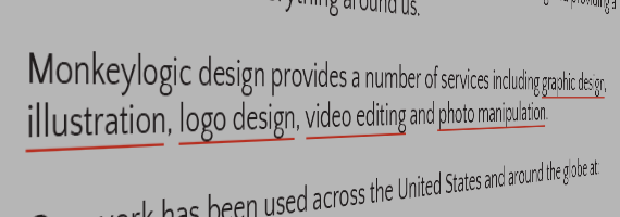
We’ve recently completed a small amount of visual tweaks to the site, mostly pertaining to hyperlinks. Personally, I’ve never cared much for the standard blue text with blue underline look that came as part all hyperlinks back in the pre-CSS days. With the ability to have far better control over text appearance via CSS, it was great to finally modify the appearance of elements as you wanted. I always felt particularly glad for the “text-decoration: none;” declaration which allows you to remove the underlines from text.
From a design standpoint, if you completely removed the underlines from text you need to provide visitors with another method of knowing when text is a hyperlink. By setting the a:link selector to text-decoration: none and the a:hover selector to text-decoration: underline you provide users a method for knowing when text they’re hovered over is a hyperlink.
I’ve preferred the method of hiding the underlines in a hyperlink since I discovered it, but now that we’re in the days of devices which don’t have pointers, setting up your hyperlinks without a visual indication that they’re hyperlinks can result in site visitors that aren’t aware that text in the middle of a paragraph is clickable.
A solution to this problem is by coloring your hyperlinks a different color and is what this site used for a long time. What I can see was a huge oversight was using the same color for all hyperlinks as the header text. Most of the headers are set to a fairly large size, but the headers in the blog are a little smaller to save space and taking a closer look at how the site functioned, it was decided we would provide a better visual for hyperlinks.
We conducting a bit of research into how other sites handle the same issues and by research I mean going to lots of different sites just to see their hyperlinks. One cool effect is to have a hyperlink underline that doesn’t appear under spaces between words and also breaks where the descenders of letters exist. The big downside of this effect is that it only works on sites that have solid color backgrounds because of the CSS being used to generate the effect. Something new I ran across are sites with hyperlinks where the text is one color but the underline is another. I was intrigued as this isn’t something that’s possible with the standard a:link and a:hover selectors.
The method of creating this effect, and is now being used on the site, is completely controlled from the CSS example below:
#content a {
display: inline-block;
position: relative;
}
#content a::after {
content: ”;
position: absolute;
left: 0;
display: inline-block;
height: 1em;
width: 100%;
border-bottom: 1px solid #c30;
margin-top: 0px;
}
The explanation for the effect is all hyperlinks are displayed using the “inline-block” and “relative” values. This allows you to use the pseudo class ::after to place a border under the text and control it with the other declarations.
Once this code is in place we then rely on the standard a:link, a:visitied, and a:hover styles to remove the actual underline, make/keep all the hyperlinks the same color as the rest of the text, and change the text to a different color when rolled over for people on non-mobile devices.
The result on this site is hyperlinked text that’s black like the rest of the text, thus making it easier to read because the hyperlinks are the same color as the rest of the text, but visually informs you a hyperlink exists because of the orange underline.
