Apple is renowned for their product design. The iPhone, iPod and iPad have set the bar for the area that each device represents. But what about the design of their packaging? I would imagine that most people would say the packaging design is just as thoughtful as the product design is without having to think very long. But pure perception doesn’t always equal the truth.
Apple’s packaging design is unique as it’s the only technology based product that uses Apple’s specific style of packaging that I can think of. Other products may be similar in which an image of the product is on the front of the box in actual size, the name of the product on one or more sides and the company logo on one or more sides. Apple does occasionally make a few changes to their packaging, but in general Apple has the packaging design down to the bare minimum information of the product name, the logo of the company and images of the product each on their own side of the box.
From a design standpoint, this is a great concept. You don’t want to clutter a design with unnecessary components so only requiring the three primary elements is a good thing. So think about the last time you were somewhere that sold an Apple product and I’m not referring to an accessory. When you saw the product on the shelves, were you able to quickly identify what was an Apple product amidst all the other products that fall into the same categories? By this, I mean were you able to identify the iPads from other tablets, iPhones from other phones or Macintosh computers from other computers? You may think the answer is yes, but really the answer is no.
If you were in an Apple store, which is where the majority of in-store Apple product purchases are made, there aren’t any other comparable devices to choose from. Therefore, you couldn’t have identified an iPad from another tablet computer. What about in a BestBuy as they’re one of the few non-Apple retailers allowed to sell Apple products? No again. Apple products have their own section in Best Buy therefore all the Apple merchandise is kept away from all the other products.
The biggest exception to the non-Apple store purchase of Apple products are cell phone carriers. The Apple products are on display right next to all the other cell phones and wireless carrier enabled tablets. However, at a cell phone carrier you don’t get to pick up a box. You tell a sales person what you want and they retrieve the product for you. You don’t touch the box until it’s handed to you. What this means for Apple’s product packaging is that it’s works great, but only as long as their products aren’t placed right next to any other products and as long as no one else starts using similar packaging styles.
In the realm of product marketing you want to create a visual style that’s unique to your product and sets apart your product for other similar products. At the moment Apple’s packaging works but we don’t know how it would actually function if Apple didn’t segregate it from other products. It’s easy to claim that your packaging is more recognizable than the rest of your competition when you have it placed in a physical area where your competition can’t sell their products or if a sales person has to go get the product for you. Placing a package design on a shelf with dozens of other similar products is where the real challenge lies.
Think about going to a grocery store you’ve never been to before to pick up toothpaste, shampoo, cereal and a magazine. Once you locate where these products are shelved how easy is it for you to find the exact brand you’re looking for? It’s going to take a while even if you’re very familiar with a specific brand and how easy would it be if the name of the product wasn’t on the face of the packaging? That would significantly increase the difficulty of finding what you were looking for.
A common practice for some products is to use similar branding characteristics to help a product make a mental connection. Most nacho chip packaging use the colors yellow and orange and a Mexican based theme. Iced coffee uses a lot of brown coloring bean imagery. Diapers use babies wearing the brand of diaper on the packaging. So how difficult would it be to find a specific brand of diaper without the name of the brand and product on the face of the packaging that’s facing you? Would you be willing to rotate dozens of boxes of toothpaste to find the one box of toothpaste that you want? If the brand was on the side facing you, what about a specific type of toothpaste as there are 31 different boxed varieties of Crest toothpaste? That would be a lot of box turning.
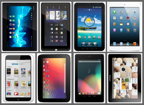
Say that all other tablet makers had decided to follow Apple’s lead and use the same style of packaging design for their products and Apple was to place their products on a shelf with all the other tablets. The following image shows 8 different tablets all using Apple’s image only product style for the front of the box.
A friend of yours, that’s behind on technology, has heard of the great abilities of a tablet and wants to get one. What do you think the likelihood would be for them to walk up to a shelf like this and pick out the iPad without knowing anything about it other than what you’ve described to them? With the exception of a few manufacturers, the name of a tablet is generally placed on the back so unless you know your products really well you likely won’t be able to tell at a glance which product is which.
From a design standpoint, the Apple packaging is unique. However, that’s only for the moment as no one else is using a similar style of packaging design. I highly doubt that more organizations are going to start using this type of simplistic packaging design for their products, but if they did, they would immediately see the problem with how a brand-less front of packaging design is going to result in product confusion and likely lower sales. Apple may have a leg up on visual aesthetics of their products, but their packaging design needs to be rethought.
